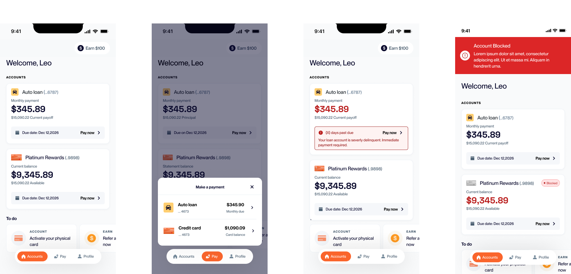
Using design to scale
Our current consumer mobile app doesn’t scale for a multi-product account holder environment. My design team and I proposed and received approval to design a new information architecture to support multiple products and to position our app to compete against best-in-class fintech organizations. Crucially, it also demonstrated how thoughtful design allows Yendo to scale as an organization. Status: In development, to be launched July 2026.
Selling a redesign
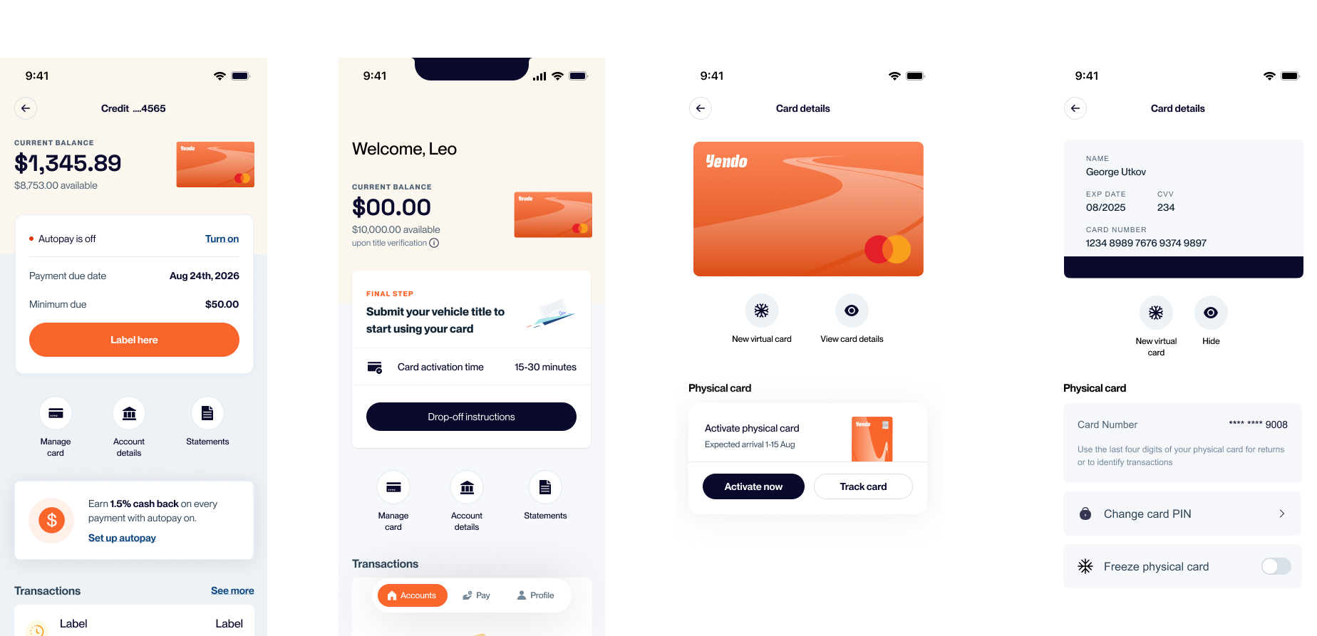
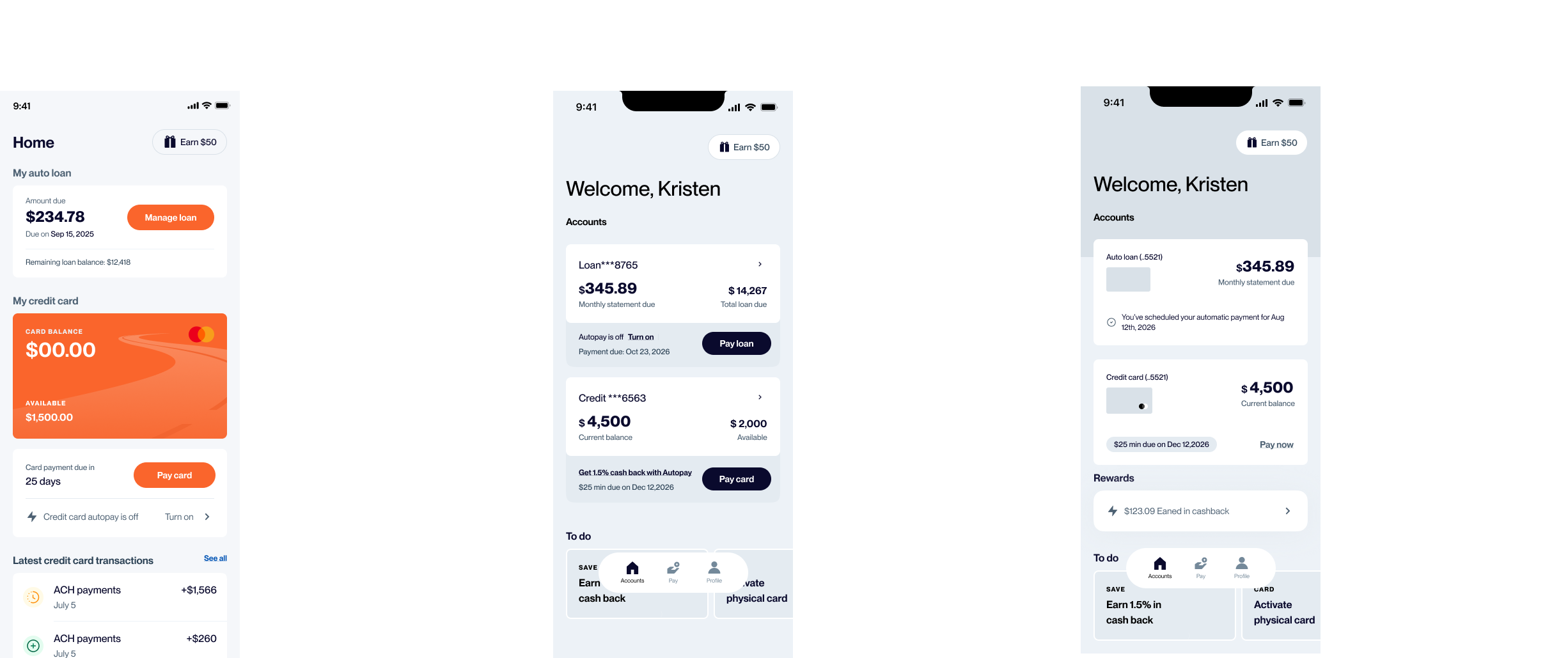
As soon as we started designing for our bundled credit card/auto refi product our design team realized we were on shaky ground. Our current IA was incredibly flat: there were no true “child pages” since everything, including transactions, lived on a dashboard. When we had multiple products, transactions would have to be tied to a particular project and most likely would need to live within a specific product’s detail
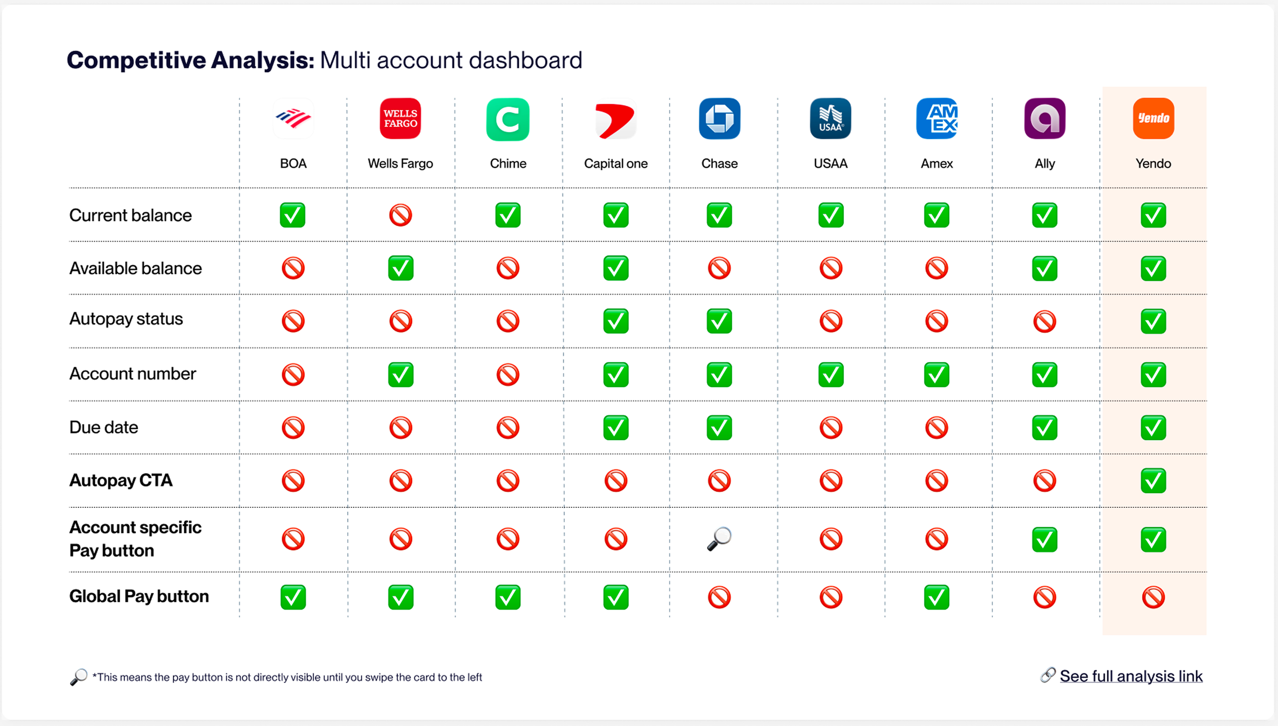
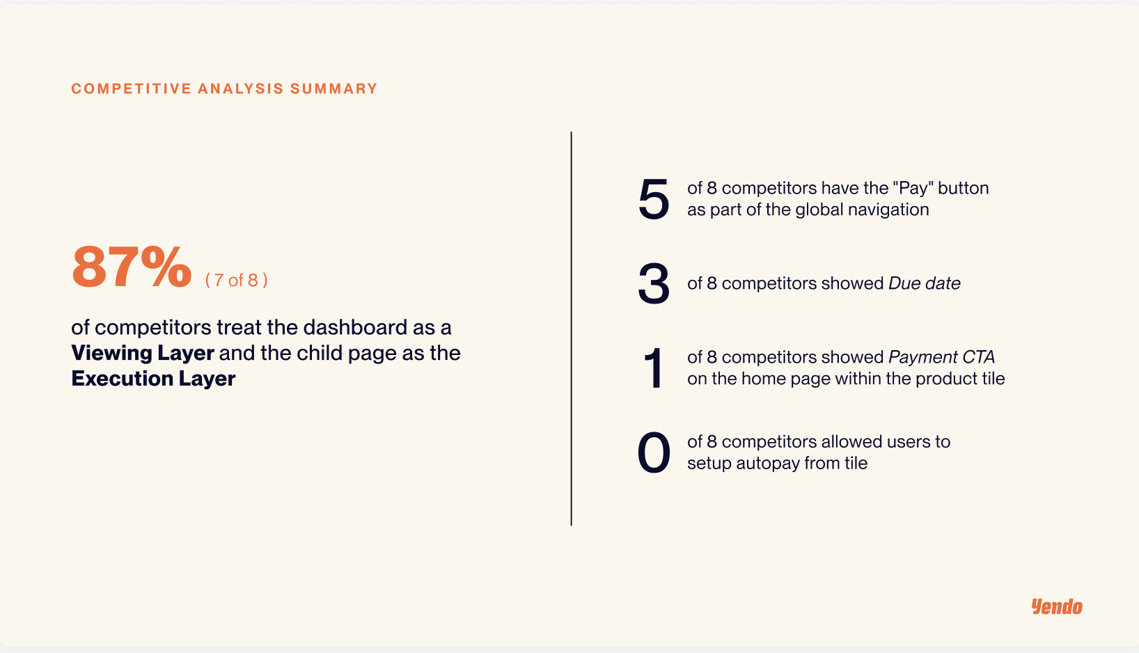
page. I also knew, from understanding our business roadmap, we had big plans to quickly expand our portfolio. Based on this knowledge, the design team mocked up low-fi prototypes exploring different ways our IA could be reworked. We had to explain why putting every possible action on the dashboard was not recommended, so we provided both competitive analysis and visually demonstrated that ask for our CEO.
Detailed design and eng handoff
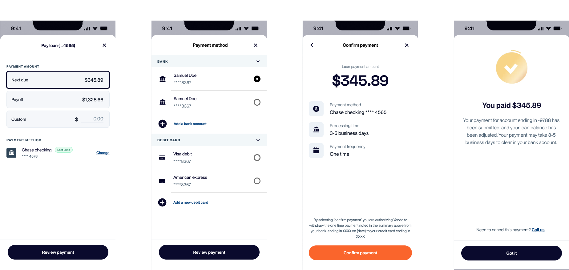
We began detailed design in chunks, taking care of child pages, then payments, and account.
Transaction updates proved tricky technically since it we rely on a third-party (Corecard) to manage the display
of disputes and new statuses (e.g. pending) so that will be designed/implemented in Q3.